This post is to help you make your home studio look GREAT (on a budget!), by organising and upgrading in just a few simple steps.

When you work from home, you really need a dedicated space to work from, be it a home studio, a small study nook or office, or a desk in the corner of the living room (that’s me right now!). But as makers and creatives, there’s a huge (inevitable?) risk that our spaces will be completely over-run with supplies and current projects. Or worse, you may not even have a space because not many people can afford to splash out on a home studio when they’re just starting their small businesses!
I’m here to give you three quick tips on how to upgrade (and organise!) your home studio or craft room, and of course, it’s going to be really budget friendly.
Storage
The key to a good looking and organised studio space is storage, and the consist look or style of that storage.
First, work out all the tools and accessories you need to store, and divide them into two groups – those that you use all the time (daily or multiple times daily) and those that are essential but get used on a less regular basis (maybe once or twice a week).
The items you use less often can go into drawers or cabinets – hide them away (still within reach so you can access them easily – not boxes upon boxes stacked up so you can’t get to the contents!) so they don’t add any clutter to your workspace.
The items you use daily need to be easy to grab at any moment, but also just as easy to put away so they don’t add to the “makers mess”. You could grab some rails (from ikea for only $1.50 ea) and have hanging baskets or tubs to hold pens, pencils, paintbrushes and other bits and bobs. The key here is to make sure all the tubs or baskets are identical to create consistency, for a uniform and organised look (this works great for kids art and craft stations too).
Work Surfaces
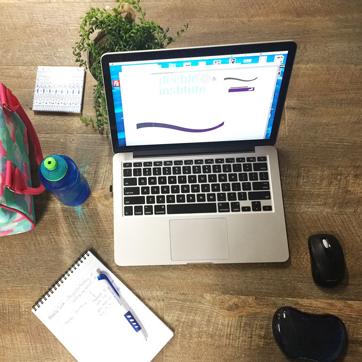
Ideally (if you’re making physical products) you’ll have two work surfaces: one for your computer and accessories, and one for making. Alternatively one large surface can accommodate both, but the making area mess always tends to creep onto the computer area (for me at least!) so it’s good to keep them separate if you can.
Your making surface needs to be sturdy and able to take a bit of a beating. Recently I re-covered a marked (and pretty gross) studio table at the Uni Design Studio (my new part-time day job) with stick-on vinyl planks from Bunnings, and it looks AWESOME. So if you’re short on cash, I highly recommend picking up an old, feral el cheapo desk from your local tip (there are some available at my local Green Shed for less than $30) and grab a pack of vinyl planks (the ones I bought were about $60, and would cover two large tables), and you’ll have an ace work desk for under $100, that can look more like it cost $800.
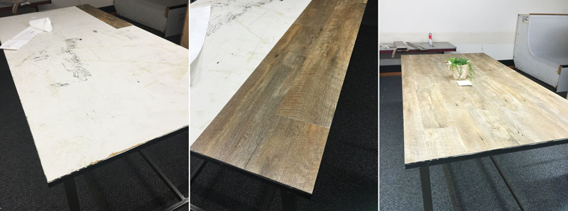
I took this un-styled and super quick snap under horrible fluorescent lighting, imagine what you could do for your product photos or behind the scenes snaps with a little bit of time and effort put in!
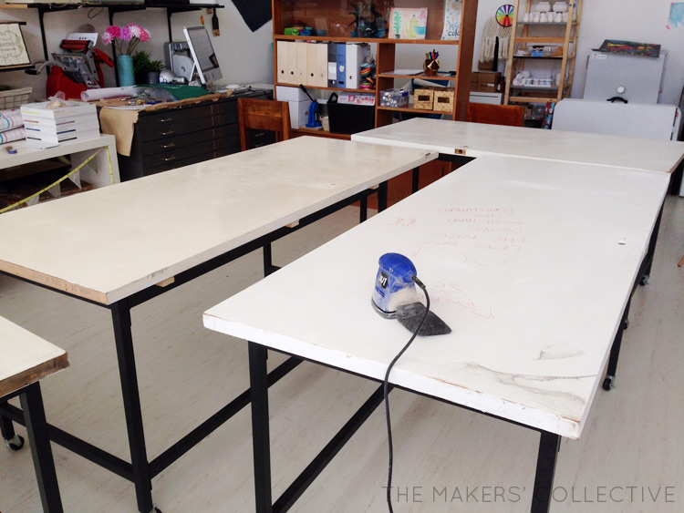
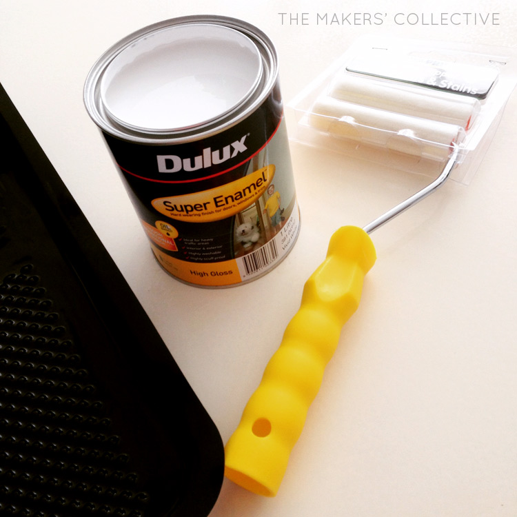
Another (even cheaper!) option is to pick up some old interior doors (these go for $5ea at the Green Shed) and some brand new tables legs from ikea ($6 each!), give the doors a lick of white enamel paint and you’ve got a gorgeous, long workbench to spread out on for about $40.
If you want your computer or “light work” space to look really shmick, grab a glass top from Ikea too ($35 for Malm… I know, sensing a theme here? It’s no secret I love Ikea haha) and push the style dial to 11, for a grand total of $75.
Walls
There is nothing faster, easier, cheaper or more effective in upgrading a space than a lick of fresh paint. I pretty much believe you should always paints all the things. Always.
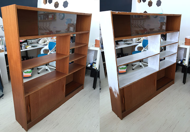
Giving walls, bookshelves or furniture a fresh coat of white paint will instantly revitalise a space, but if you’re feeling adventurous, grab a roll of washi tape and you can give a wall some real wow factor! See the full tutorial post on my geometric wall (shown below) here.
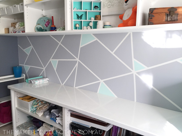
I think people really underestimate how effective simply painting something can be (and surprisingly easy!). My top tip here is to just go into Bunnings (or Masters or Home Hardware, wherever) and ask for the cheapest 1L can of white paint they’ve got. If you’re painting walls get “flat” or “matte”, if it’s a work surface that you’re going to want to wipe down at any point, get gloss enamel. Get them to tint it a colour if you want, but the main thing is, the paint does not have to be fancy or expensive to look great. If you’re painting over a really dark wall, or dark wood, also grab a can of white primer to go underneath (again, doesn’t have to be fancy!).
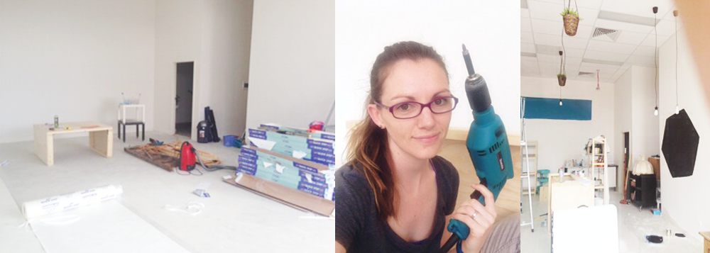
I’m no stranger to DIYing a studio on a budget, and soon enough I’ll have to get my ideas book out again to re-organise our own home office space, as I’ll be bringing a bit of stuff home from The Makers’ Hub once I move out later this month. I might need more than these three tips to help me fit everything in though! Wish me luck 😉
What can you do this weekend to help you organise or upgrade your own home studio area, so that you have a beautiful, inspiring space to work in?
If you're ready to take your business idea and make it a reality, it's time to become a member of The Makers Academy.
I give you the tools to plan, launch and grow your idea into a thriving business so you can become self-employed and stay that way.
