When selling your products online or showcasing them on your website, using excellent photographs could be the difference between a sale and a closed browser window. Your product photos need to entice the viewer to want to know more about the item, and ultimately get them to click “buy now”.
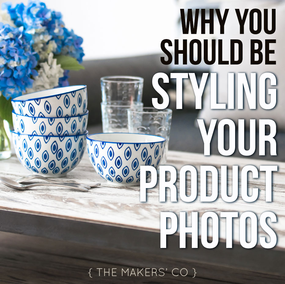
How you style your products photos is really important and can be tricky to get right, but with a bit of practice and these helpful tips, you’ll be well on your way to sharing beautifully styled photographs, showcasing your products in an aesthetically authentic (and gorgeous!) way, and making more sales along the way!
Wait, what? What the hell does “aesthetically authentic” mean??
 The style of your product photos need to sit well with your branding. Your branding needs to sit well with you, your values, what your business stands for and what you are trying to communicate to your customers. So an aesthetically authentic photo is one that successfully represents your business and it’s ethos, visually.
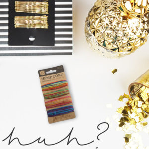
Basically, you want your photos to suit your brand. You wouldn’t style a natural, organic hemp product with glossy, shmick, gold pineapple props… Would you? No. It doesn’t make sense, and is completely unauthentic, aesthetically. So before you even start thinking about styling your product photos, make sure you know what your brand style is, so everything is cohesive and authentic!
Why should I style my product photos? Can’t I just whack it on a white background, so the product stands out?
Well, yes, and I recommend you DO have a photo or two of the product with no props, preferably on a white or plain background, really making the product stand out. But to add to that type of shot, I really think styled photos will help you sell more products, and here’s why:
Styled product photos help tell a story
Styling plays a really important role in telling a story about your products. It gives your products context, and if done correctly, can put your customers IN the story as they’re viewing your images. With this in mind, you want your images to be aspirational to your ideal customers. So if your customer is a pregnant woman who loves Scandinavian style interiors, and you sell wooden baby teethers, it would be a smart move to style your product photos in a bright, clear, minimalist style to appeal to this woman. The story you are telling is the one of her future, when her baby is born and she is playing with him in his Scandi style nursery, and he is happily nomming on one of your wooden teethers that she purchased before he was born.
That’s pretty powerful stuff for one photo, a story that a plain white background just can’t convey.
When styling your products, you can show them in realistic situations, but also don’t be afraid to show them in creative environments that might deliver a similar feeling or response from the viewer.
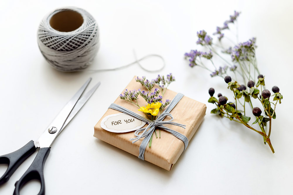
Styled product photos set you apart from the competition
Let’s face it, you are NOT the only person in the world selling candles / tea towels / craft kits / [insert other amazing product here]. You need to set yourself apart from others in your industry selling similar products to you, and you can do that by styling your product photos in a way that is unique to you. Don’t be tempted to follow the trends you see online, find your own style and run with it!
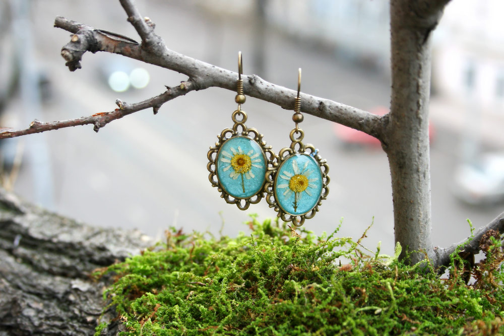
Styled product photos help you form a cohesive range
When you sell more than one product it can sometimes be difficult to bring them together in your store or website and make it clear they are all from the same business. Styling your range of products in the same or similar way can ensure that there is no question this necklace and that headband are being made by the same person, are the same high quality and are part of the same current collection. Or perhaps you have a few items that have a theme, seperate to your normal range (for example, a range of screen print designs especially for Mother’s Day, Father’s Day or Christmas). These products could be styled in a similar way to express that theme and bring them together to form a consistent “holiday” range of products.
 Free Download
Five things you can do right now
to improve your photography
[boxzilla_link box=”13500″]Click here to grab yours now[/boxzilla_link]
So, how do I do it? Just chuck some props in the shot and hope for the best?
That’s pretty much never a good idea, unless you’re really lucky! You need to keep four main things in mind when styling your products:
Don’t go overboard, the star is your product
The focus of your shot needs to be your product, every time and always. If you have too much going on in the background (or worse, the foreground!), the image will look too busy and cluttered and the viewer will be distracted from the star of the show. Don’t fill the frame with too much stuff, keep it simple and balanced, and ALWAYS ensure your product is in clear focus, both in composition and optically.
Choose props that emphasise the purpose or story
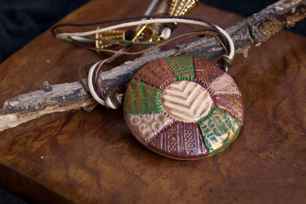
Try to keep your props “on theme”, so they add to the story or emphasise what your product is actually meant to do or be. Don’t use items that have nothing to do with your product just because they look pretty or on trend (remember: keep it aesthetically authentic!), instead look for creative ways in which to use unusual or unique props to style your product in a way that makes sense.
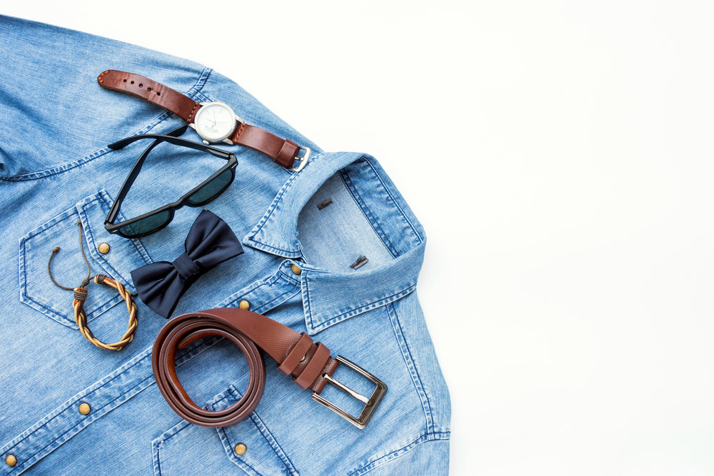
You could also think about using complimentary products in your photos for social media sharing, which is an excellent way to tell a story, and at the same time support other makers to grow their business too, which is a win for EVERYONE! =D
Don’t forget the principles of good photography
It doesn’t matter how good your props are at telling a story, if your photo has bad lighting, bad composition, is blurry or the colours are dull, it’s not going to help you sell your product. Make sure your all of your product photos are bright, clear and sharp, with good compositional balance and great true-to-life colours.
You might also like to read: Why your brand should be your priority over social media
Consistency is key
Your product styling really should be the same across every photo in a collection, or even across your whole product range. This brings all the products together to form a cohesive range and makes your products instantly recognisable to repeat customers. It also adds to the story or theme of your range, and strengthens your brand overall.
So, are you ready to give product styling a go?
I’d love to see what you come up with, feel free to shoot me an email with your pics for feedback! =)
Product photos in this post are either my own or from Shutterstock, thanks peeps!
If you're ready to take your business idea and make it a reality, it's time to become a member of The Makers Academy.
I give you the tools to plan, launch and grow your idea into a thriving business so you can become self-employed and stay that way.
