If you want to DIY the design elements for your business or blog, high fives to you! But for the love of sweet baby cheeses, PLEASE try to make it not look… Bad.
Don’t worry, I’m here to help 😉 I’ve got 4 simple but essential tips you need to know to create professional, pin-worthy graphics for your business or blog!
If you’re just starting out in design, I’ve got the 4 most important things you need to know before you start creating anything. If you’re a seasoned design pro, you can probably skip right past this post.
Hover and Pin that! ⤴︎
Ok, no need to dilly dally, here we go!
#1 – Choose your image wisely
Choose an appropriate image related to your content that adds to your message instead of distracting from it. If you are planning on placing text over the image, make sure the picture is not too busy or distracting.
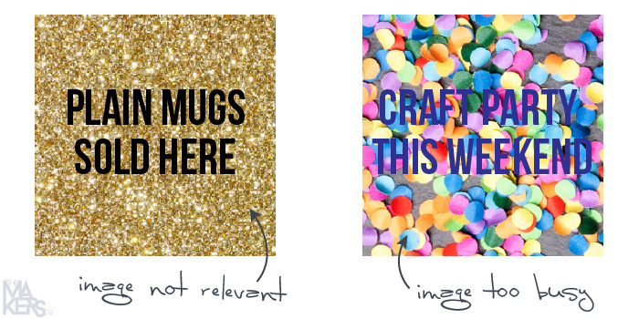
Don’t place text over high contrast areas, it will be way too difficult to read. Try to find an appropriate area of the image to place your text over (keep this in mind when choosing your image!) so it’s not randomly hanging over the subject matter.
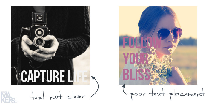
Try this instead:

#2 – Use colour intentionally
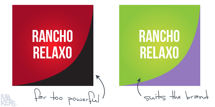
Think about the psychology of the colour scheme you choose. Do the colours you are using fit with your brand, and message you are trying to communicate?
For example, typically red is associated with passion, power, romance, and high energy. If you are trying to promote a relaxing yoga retreat, red might not be the right choice. Maybe purple (for femininity) and green (for relaxation and the environment) would suit the message more appropriately.
#3 – Align the elements of the design
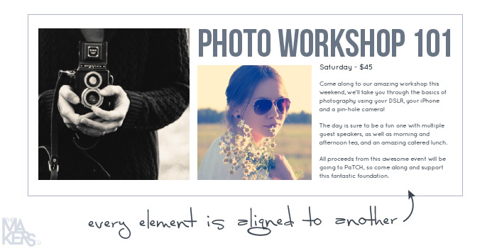
This is the easiest way to take an amateur design and make it look 100% more professional. Align stuff. The top heading can align to the top of the image next to it. The paragraph text can line up with the graphics below it. The images can be set in a grid, instead of placed haphazardly all over the place like drunken monkeys trying to get off the page.
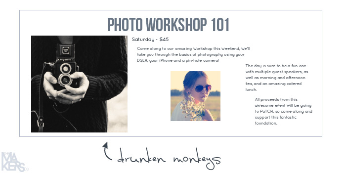
Try to avoid center-aligning everything in the composition, this should generally be reserved for very formal designs (wedding invitations and the like).
#4 – Typography has personality, make sure it fits
Know your fonts typography. Do some research on “good vs bad fonts” and really think about the style of the typeface you choose to represent your brand. There is good reason for why people bang on about how you should never use Comic Sans, Papyrus or Jokerman… but I’ll leave that for another day.
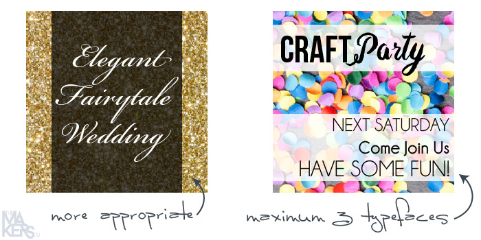
Each typeface has a visual personality, and you need to make sure this is aligning with your brand, and also the message you are trying to convey in each graphic you create.
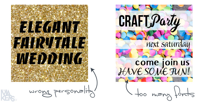
Never* use more than 2 or 3 typefaces in the one design, or it will look too busy and amateur.
*Rules are meant to be broken baby! But seriously, know what you’re doing before you break shit, or it will just look broken.
Has this helped you at all? Set you on the right path to awesome graphic creating goodness? Let me know in the comments below!
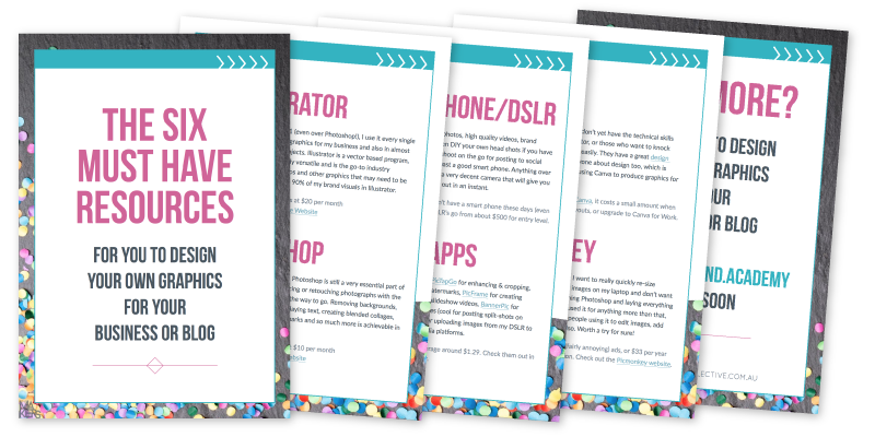
You can also watch a 20 minute Illustrator video tutorial for some technical know-how, and definitely make sure you download the free PDF by popping your details in below, so you know exactly what you’ll need to get started and be proficient at creating your own graphics.
 [mc4wp_form id=”10774″]
If you're ready to take your business idea and make it a reality, it's time to become a member of The Makers Academy.
I give you the tools to plan, launch and grow your idea into a thriving business so you can become self-employed and stay that way.
