A mood board is a composition of images, colours and type that forms a theme, style or mood for your project. They’re really useful in determining the direction of your visual branding, and often form the basis of a more formal style guide down the track. Creating a mood board from images that represent the style or personality of your business is also great to build out your brand colours, ensuring consistency across your visual brand.
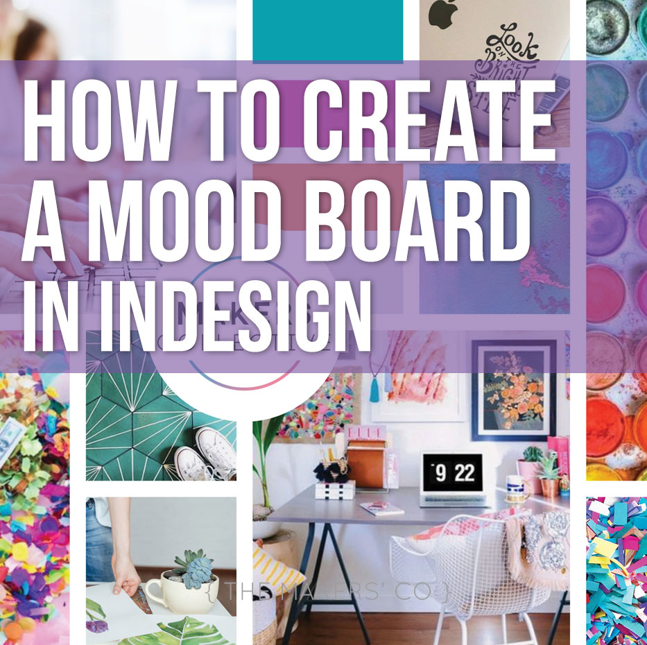
Mood boards can have a multitude of applications and uses, you can create them for your whole brand, individual projects, product or collection ideas, and even events related to your business (I’m about to put one together for an exclusive live event I am planning for members of the Makers Academy).
For me though, a mood board is a super efficient and easy way to remind myself of my brand personality on a daily basis, in visual form. Much like a vision board, the best way to keep your mood board front and centre of mind is to either print it off and stick it on your wall above your computer, or set it as your home screen on your most-used device. But let’s take a step back for a second: How do you actually create a mood board in the first place?
You might also like to watch: How to create your own blog post graphics in Photoshop
You need to collect and collate images that speak to your brand personality. I’ve put together a quick tutorial for you here on how to do it in Adobe InDesign.
Step 1
Collect images that epitomise your brand (or event, or project… whatever it is that you are creating the mood board for). Think about texture, lifestyle, sights/sounds/smells, activities, patterns, typefaces and any other design elements that appeal to you – save them all into one folder to make them easier to find later. 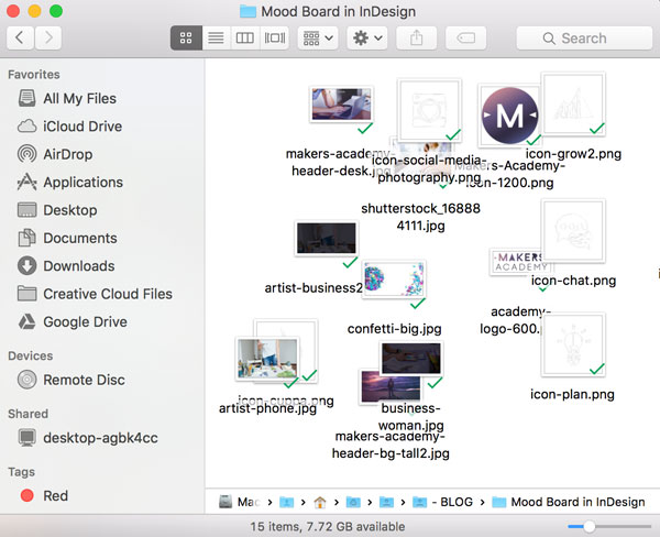
Step 2
Create a new InDesign document, setting it to the size you would want to print it at now or in the future (you can always scale it down for the web later, but you can’t scale it back up if you start at web size, without losing quality). 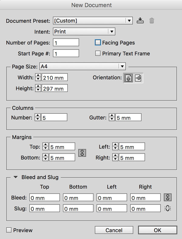
Step 3
Here’s where people generally just shove all their images into the page and try to shuffle them around to make it work – try to avoid doing that! We want this to look nice so we can stand looking at it everyday 😉
Instead, think about your layout – Start with placing frames on the page in your desired layout (you can check out some Mood Board examples on Pinterest) – or download my free template.
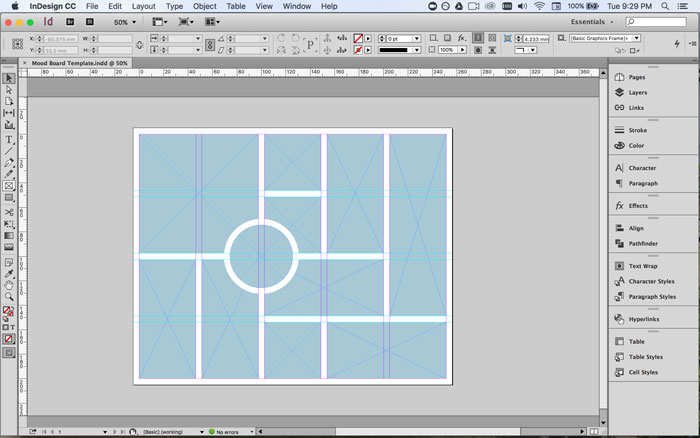
Mood boards generally look best when there is even spacing around each image (but this is definitely not a hard and fast design rule!). To achieve this I set up columns and guides with an even 5mm spacing between each frame, and gave my circular frame a 5mm white stroke on the outside of the object.
Step 4
Place your images in the frames. Select one frame and go File > Place to put your images into the frames.
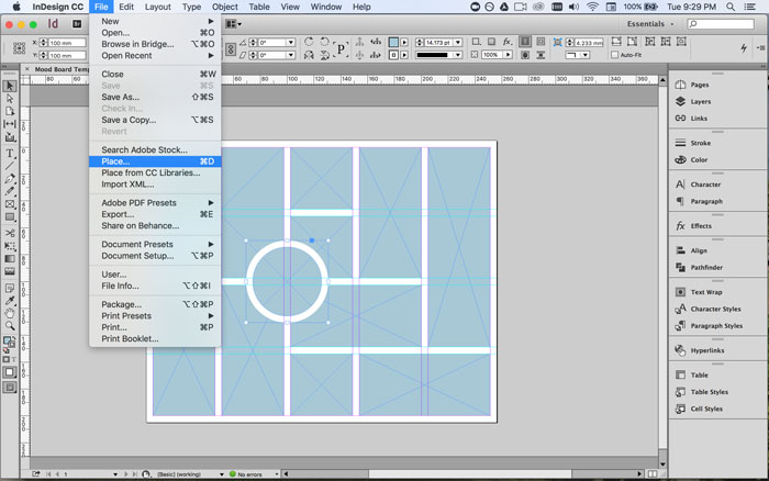
TIP: One thing to remember about InDesign is that the image and it’s frame are SEPARATE objects. This allows you to change the shape of the frame without interfering with the integrity of the image – but it can also make it super confusing when you’re just starting out, as often it looks like your image has been chopped in half or doesn’t exist at all.
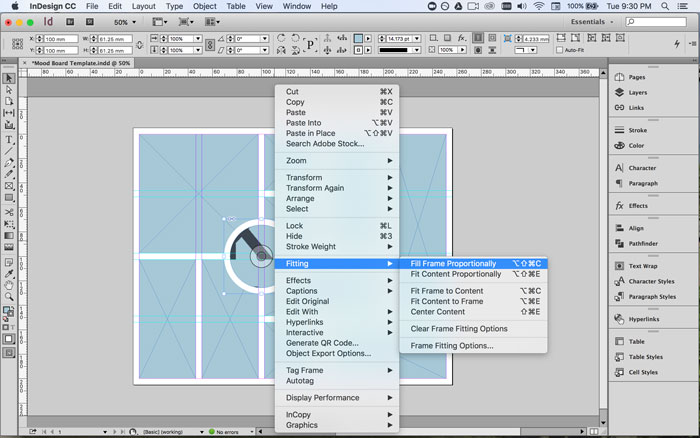
When you first place your image into the frame, it might fit great, but it might also be way bigger than the frame and you’ll need to scale it down (the image that is, not the frame – remember they are separate!). You can do this two ways: first, right-click the image and go to Fitting > and choose either Fit Content Proportionally or Fit Content to Frame (it depends how much of the image you want to show and what shape the image is compared to your frame – you can try all the other options also! Just go Edit > Undo if you don’t like the result).
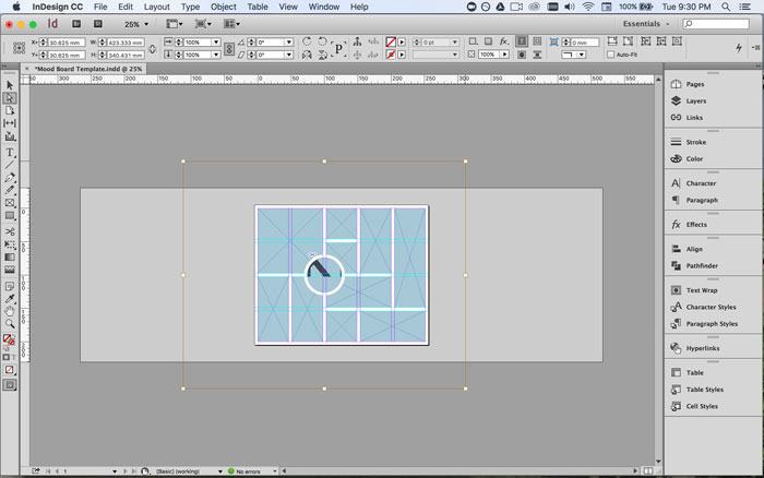
The second (and my preferred) way is to grab the Direct Selection Tool (the white arrow, shown below) and click on the image. This will select the image instead of the frame, and allow you to resize it independently of the frame.

Once you’ve got a brown outline, you can grab a corner of the image and drag it inwards to make the image smaller (always remember to hold down the SHIFT key whilst dragging, otherwise your image will not retain its original proportions and be distorted).
Go ahead and place the rest of your images into the remaining frames.
Step 5
Adjust your layout. The great thing about using InDesign for this type of work is that you can really easily move around the frames, as well as change their shape and size. Spend a bit of time swapping your layout around until you are happy with how the images are working together in the composition.
TIP: Don’t worry if your images look a little fuzzy or pixellated when you place them in, this is just InDesign’s way of saving memory by showing a lower quality version of the final image. As long as the images you saved originally are a good size (anything over 1000px wide/high should be fine) you won’t have any issues once you export the file as a jpeg/PDF or print it off.
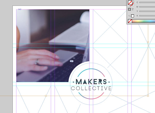
If you want, you can check your images by going View > Display Performance > High Quality Display (but remember to turn it back to Typical Display or Fast afterwards, otherwise you might find the program will run slower as you work).
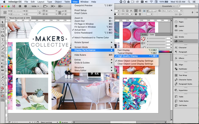
Step 6
Select your brand colours. Once all your images are placed, you should be able to see a common colour theme running throughout. We can now use the colours within the images to select 3-5 colours that will form your brand colour scheme.
You might also like to read: Why your brand should be your priority over social media
Select the frame that you want to fill with a colour swatch, then select the eye-dropper tool and click around the images to find your colours. You can see in the video below that the colours I ended up with are very close to my actual brand colours, so I’ve done a pretty good job at choosing images that represent my brand – good thing!
Step 7
Analyse your board. Once you’re done, you can switch to preview mode (if nothing is selected on the art board just click “W” on your keyboard as a shortcut, or otherwise go View > Screen Mode > Preview, and cast your eye over the composition. Does anything seem out of place?
The image I’ve used in the top left corner of my mood board looks like the odd one out here, it’s much darker than the rest and give off a different vibe, which I didn’t notice at all until everything was in place and I took a moment to look over the composition as a whole.
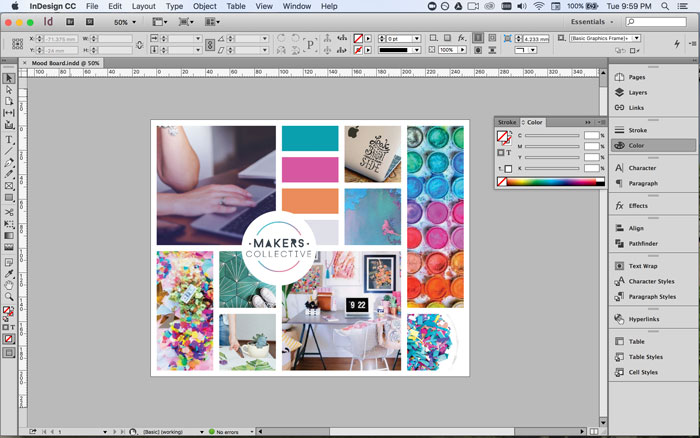
The image I replaced it with fits much better and now the whole board is light and bright and fun – so don’t skip this step!
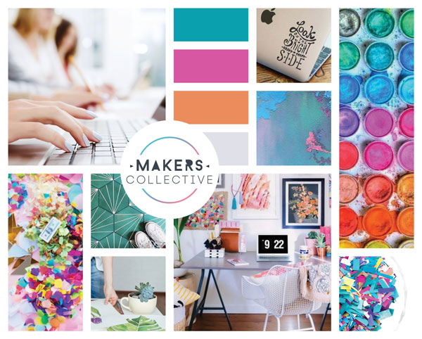
When you’re happy with the design, go File > Export and save your mood board as a jpeg or PDF file (also be sure to save your original InDesign file so you can edit it later if you need to!).
And you’re all done!
For more tips on creating your own mood board, this is a great little article over at Creative Market with some good examples included too.
I would absolutely love to see what you come up with for your own mood board, so be sure to share in the Makers Community group and tag me!
CAN YOU CONFIDENTLY SAY YOU ARE WORKING ON THE RIGHT THING, RIGHT NOW IN YOUR BUSINESS?
Sometimes, even when we are doing all the right things, it can feel like we’re spinning our wheels and not moving forward at all. This could be because you’re focusing on the wrong area of your business – or doing all the right things, but at the wrong time.
