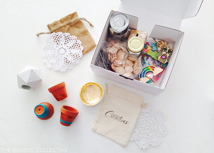
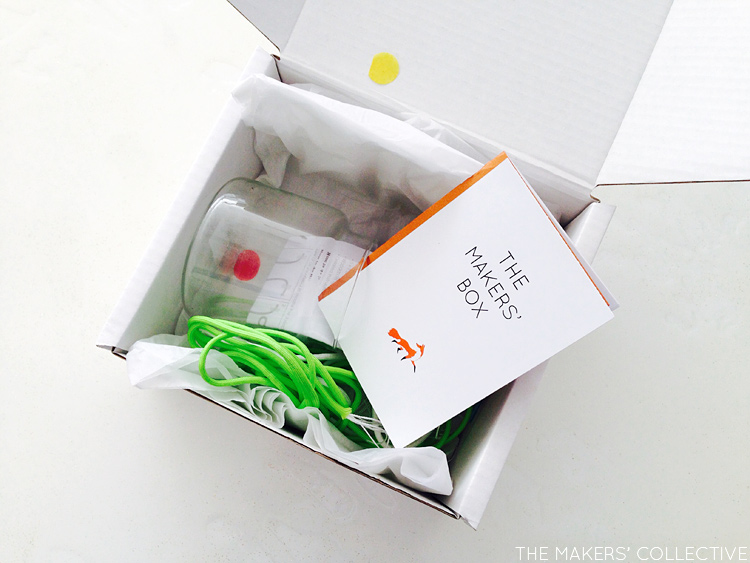
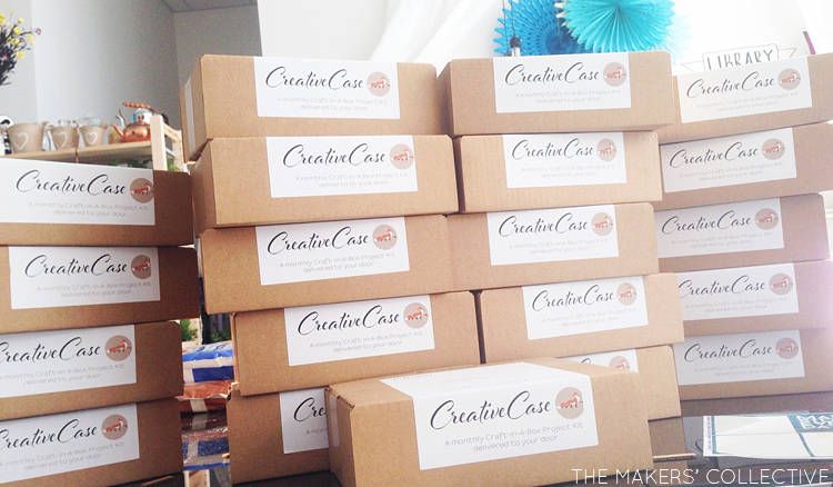
We’ve recently undergone a transformation with the re-naming and re-branding of our Monthly Project Boxes, from “Creative Case” to “The Makers’ Box”, and with this, the labelling, box type and interior packaging all needed to change.
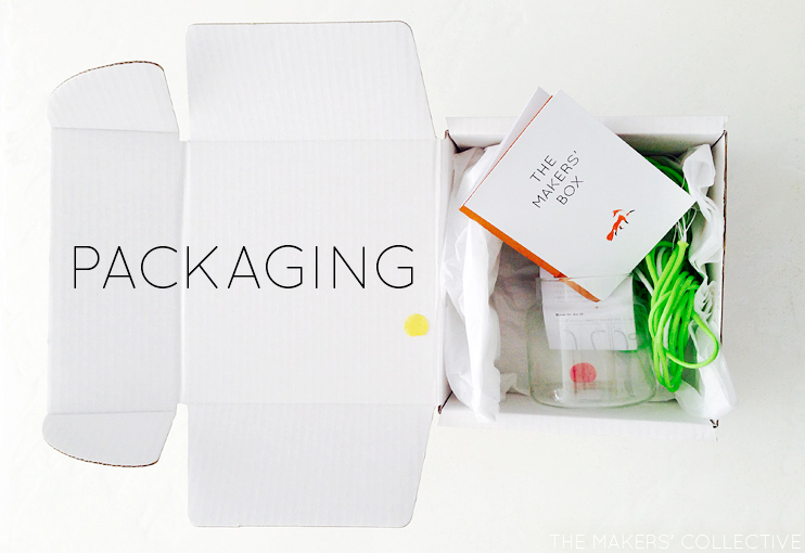
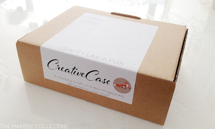
If you are selling a product you need to think carefully about the way you package your product to appeal to your potential customers. The packaging of a product is the first point of contact for your customers to your brand. The design should reflect your brand’s values and be consistent with the rest of the corporate design of your business. For instant recognition or to grab people’s attention from a distance, a well designed package could be just what you need.
Packaging is one of my favourite areas of design, for so many reasons. I love figuring out how to best represent a brand or product with the way it is presented in it’s container, wrapping it in an extension of itself and more times than not designing a neat label to seal it all together.
I’ve had the most fun working out how best to package The Makers’ Box monthly project-in-a-box kits. We’re going with all white packaging, with a copper foil accent. It’s going to be elegant and stylish, but with just the right amount of rockstar thrown in, to get you in the mood for making.
My first go-to (besides Pinterest for branding inspiration of course!) was PackQueen. We’ve been getting our boxes from this company for almost a year now, and I’ve been really impressed with the products but also with delivery times and customer service. I came across them last year when searching for affordable packaging supplies, and when my design students had to do a mock packaging design assignment and find out costs of boxes, they independently worked out that PackQueen supplied the most affordable options. So that’s saying something =)
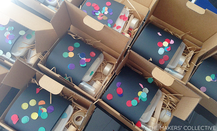
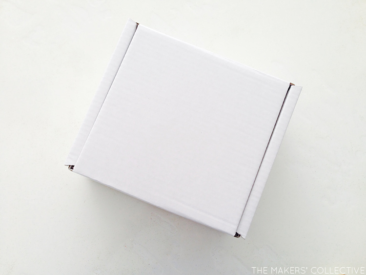
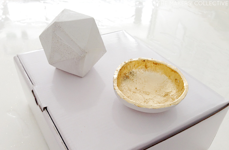
So I ordered some samples of various white boxes for our new shmick branding for The Makers’ Box, and I’m actually torn between two options: One is super glossy and looks really slick, whilst the other is matte but is a better box for the product. They are both slightly bigger than the current boxes we are using, which means we can fit bulkier supplies in, but also means when the supplies are small (a jewellery project, for example), we need to work out how to fill up the interior without causing waste.
So that’s where we are at right now! I will be revealing the new design and branding for The Makers’ Box in the next couple of weeks.
What do you think?? Which box should we go for… prettier, or more practical??
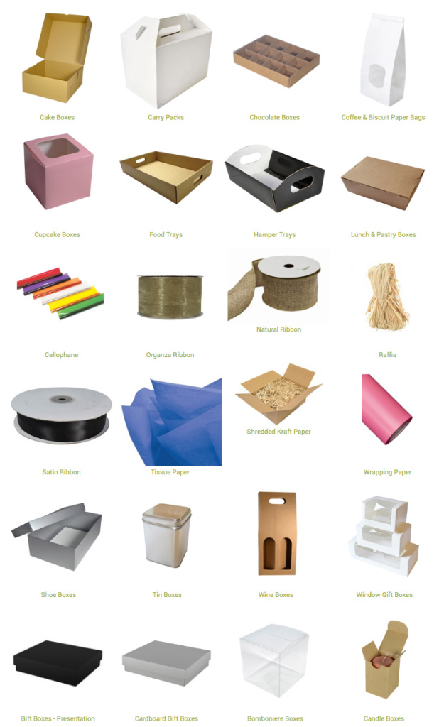
Our partner for this post is PackQueen. If you are interested in checking out their extensive range, simply click on the image below =)
