Despite what many people have been led to believe in business, a logo is not your brand. Your brand is actually an incredibly important but intangible thing, and at it’s core, your brand is a promise you make to your customers or audience.
Your logo is just one visual piece that helps deliver that promise.
A logo alone cannot deliver anything but perhaps a nice aesthetic (if done well), and to ensure the success of your business, you really need to create your brand identity holistically and make sure all of your graphics are cohesive and represent the core values of your business, while delivering a clear message to your audience.
With that in mind, I’ve collated a list of all the visual components that can make up a brand identity, which should help you to create a cohesive suite of graphics for your business, and will also save you loads of time if you set up one file or folder to house all the designs, making it easy to find, edit and update them at a later date.
Keep in mind, these items should not be created until you are really clear on your brand messaging and the true purpose of your business, otherwise you may be unwittingly communicating the wrong message or confusing your customers about what you do or how you can help them with your products or services.
You might also like to read: Why your brand should be your priority over Social Media
Another thing to remember: this is quite a comprehensive list, and it’s unlikely you will need every single one of these things. Many new online business’ will not have an immediate need for printed letterhead or comps slip stationery, and most businesses will be focussed on only 2-3 social platforms, but I’ve included it all here to ensure the list encompasses everything possible.
Of course if I’ve missed anything, please let me know in the comments and I’ll add it to the list!
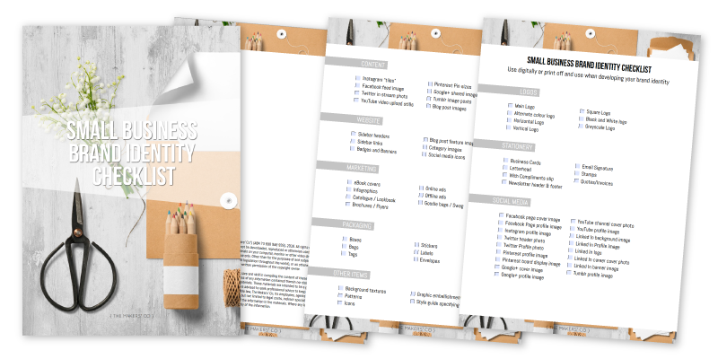
I’ve also created a handy downloadable checklist of all the items, which you can grab by popping your details in below. This might be useful for sending to your graphic designer, or printing off and keeping beside you if you are planning to DIY the graphics yourself.
[boxzilla_link box=”13497″]Click here to grab yours now[/boxzilla_link]
Logos
Usually a business will have one main logo that is used the majority of the time, but sometimes it is also necessary to have alternate versions to use in different circumstances. For example, The Makers’ Co circular logo would be too small to scale down to fit on a pen and still be legible, so the alternate horizontal version would be used.
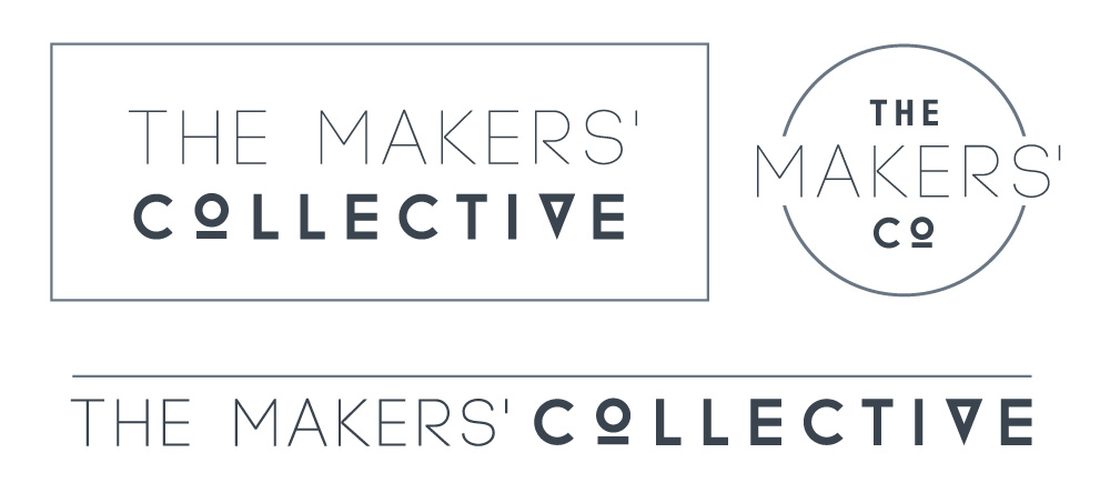
If your logo in designed in colour, it’s also important to ensure the logo works in black and white, and also greyscale, as often other organisations may need to use these versions for various applications.
• Main Logo
• Alternate colour logo
• Horizontal Logo
• Vertical Logo
• Square Logo
• Black and White logo
• Greyscale Logo
Stationery
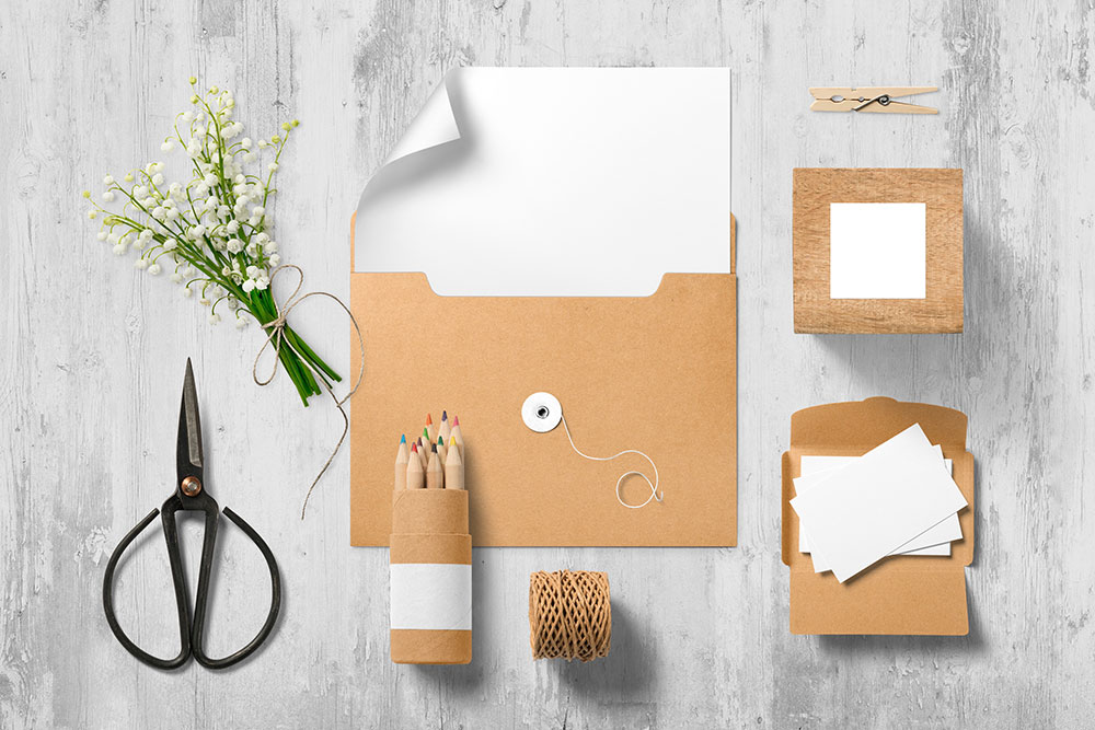
The look and feel of any stationery items need to match the style of your logo, but more importantly, speak to your target market effectively (this is why you need to know your brand inside out before beginning!).
If, for example, your your business is catering to high-end solicitors, your brand identity needs to reflect a professional, reliable, perhaps corporate style. If however your target market is young families looking for fun and adventure on a weekend, the style will be completely different: more dynamic, bright, and fun. It is super important to get this right.
• Business Cards
• Letterhead
• With Compliments slip
• Newsletter header & footer
• Email Signature
• Stamps
• Quotes/Invoices
Social Media
It’s a good idea to ensure the cover and profile images across all your social media platforms match, but it’s not good enough to create one image and apply it across all your accounts, as the sizing is different for each (and is often changed by each individual platform, so make sure you do a quick google search to confirm the current correct dimensions when creating your graphics).
• Facebook page cover image
• Facebook Page profile image
• Instagram profile image
• Twitter header photo
• Twitter Profile photo
• Pinterest profile image
• Pinterest board display image
• Google+ cover image
• Google+ profile image
• YouTube channel cover photo
• YouTube profile image (is pulled from your Google+ profile pic)
• LinkedIn background image
• LinkedIn Profile image
• LinkedIn logo
• LinkedIn career cover photo
• LinkedIn banner image
• Tumblr profile image
Content Imagery
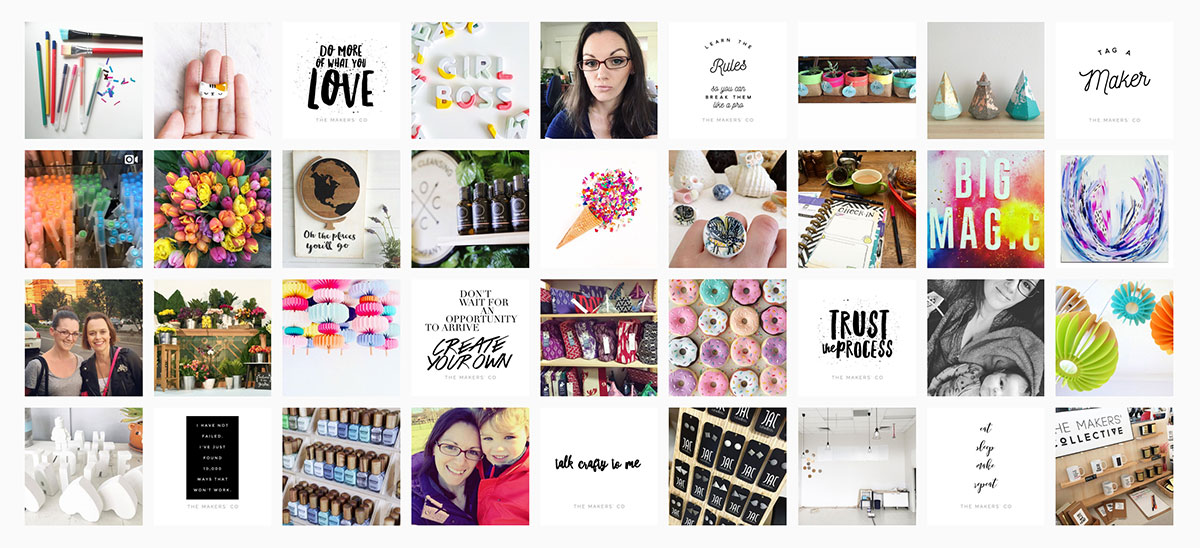
It’s really important to have a distinct style for the imagery you use across social media when sharing your own images, but also when sharing other people’s content. For The Makers’ Co on Instagram for example, I try to keep to “light, bright, colourful and fun” images every time I post, whether it be photos of my space, myself, or product photos I’m sharing from other makers. My tip here is to create a mood board for your brand, and each time you post across any platform, cross-reference the image you’re posting with your mood board and ask yourself if the image would sit cohesively within the other images on there. If not, maybe you need to edit the image, or choose a different one.
• Instagram “tiles”
• Blog post images
• Facebook feed image
• Twitter in stream photo
• YouTube video upload stills
• Pinterest Pin sizes
• Google+ shared image
• Tumblr image posts
Website graphics
• Sidebar headers
• Sidebar links
• Badges and Banners (for people to use to link to you)
• Blog post feature images
• Category images
• Social media icons
Products/services, content marketing and other collateral
• eBook covers & advertising/promotion
• Infographics
• Catalogue / Lookbook
• Brochures / Flyers
• Online ads
• Offline ads
• Goodie bags / Swag
Packaging
• Boxes
• Bags
• Tags
• Stickers
• Labels
• Envelopes
You might also like to read: Why you need to put effort into the packaging of your products
Other items
Other items you should have at the ready in your graphic library to use across your brand include:
• Background textures
• Patterns
• Icons
• Graphic embellishments / illustrations
• A style guide specifying colours and typefaces to use
It all comes back to the promise your brand is making to your audience. If your brand is “light, bright, colourful and fun”, your customers come to your page or website expecting to see that, each and every time. The graphics you design and images you use make up the visual part of the promise you are delivering. If you then turn around and post something out of character, perhaps a really poorly lit image or one too many photos of your cute cat, the level of trust your customer has for you will start to drop.
Let me know in The Makers Co community group, are your brand identity visuals cohesive and true to your brand? Or do they need some work?
What can you do this week to work towards strengthening your brand identity?
If you are in need of a complete overhaul or are starting from scratch, I offer a complete Brand Identity package over at Danvers Creative.
If you're ready to take your business idea and make it a reality, it's time to become a member of The Makers Academy.
I give you the tools to plan, launch and grow your idea into a thriving business so you can become self-employed and stay that way.
