Before you even think about your logo, business card, your website or any other visual elements for your business, you really need to ensure you have clarity around what your overall brand is, what you want it to represent and the messaging you want to be communicating.
Today I’m going to help you get to know your brand, understand why it’s important and show you how you can create a style guide to keep your brand consistent, professional and on-point.
(This post was originally written for the Mums with Hustle tribe, but of course I want to share it with you, too!)
First up, what is a brand?
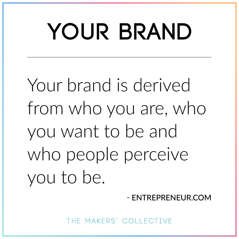
Your brand is a promise you make to your customers.
It incorporates not only your visual identity (logo, business cards, website, colour scheme, typography etc) but the standards your business lives by, the value you bring to your customers, the voice and personality you business has and the way in which you communicate with your customers and the general public.
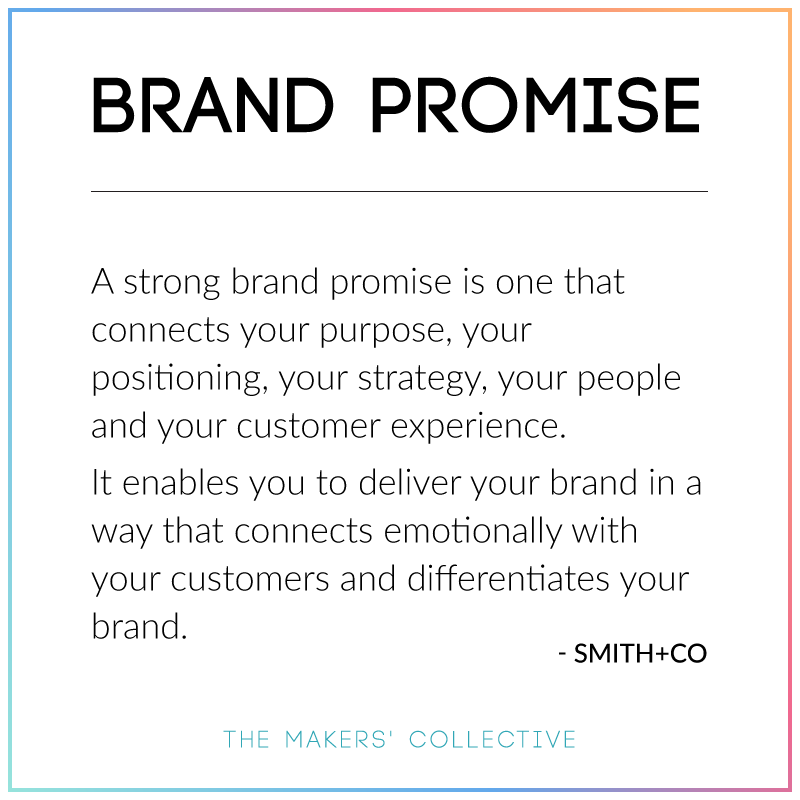
A brand promise is what your customers can expect from their experience with your business. It describes not only the experience but also the value that experience represents to them. Here are some excellent examples of articulated brand promises.
Not sure what your brand promise is? Check out my free “Know Your Brand workbook” download I’ve created to help get you started, you can grab it by signing up here.
Why having a strong, cohesive visual brand is important
Before your customers become your customers, before they have any personal experience with you or your products or services, they will most likely come into contact with your visual branding. This give them a glimpse into what it might be like to work with you, or to purchase your products. It sets up an expectation in their mind of the experience they will have with your business.
You might also like to read: Why you should be styling your product photos
As a quick example, think of Kmart (cheap and cheerful branding) vs David Jones (refined and sophisticated branding). These two stores offer vastly different price points and experiences for their customers, and their visual branding (and indeed branding across all touch-points, including the layout and styling of the stores themselves) reflects this.

Branding, when done well, allows your customer to form an emotional bond to your product, service or business in general, and your visual brand identity is that first reference point for potential customers to become loyal fans. When your visual branding is on point, you will catch the eye of your ideal customer – the people who you most want to work with or purchase from you.
It’s really important to ensure your visual brand is consistent across all touch points – logo, business card, website, newsletter, products, packaging, emails, social media and any other experience your customers have with your brand. If at any point one of these experiences doesn’t fit with the others, your brand message is diluted and you lose trust with your audience. This is a very good reason to have a style guide for your visual branding, to ensure that consistency across everything you do.
How can you ensure your visual branding is communicating the right message?
A designers job (and where their expert knowledge and qualifications are invaluable) is to translate your brand – its personality, voice, and promise to customers – into a visual identity. If however you aren’t in a position to hire a professional designer, or you just want to create the design of your business yourself (provided you have some skills in this area), there are some guidelines you can follow to ensure your brand design is communicating your brand message effectively.
You might also like to read: The top 5 reasons you need a website for your business
These are often referred to as the Elements and Principles of Design. Did you know that the thickness, colour and style of the line you use in your logo is saying something to your customers? Did you know each typeface and font has it’s own personality and voice, and that every colour has a psychological history, which elicits different emotional responses? Are you using the correct colours, lines, shapes and images in your branding?
Like any visual language, once you know the theory and meaning behind design elements, and how to use them effectively, creating a successful ad or promotion, graphics for your website or newsletter becomes so much easier, because you know the language you are speaking.
What is a style guide?
A style guide not only encompasses the visual elements of your brand (as outlined below), it also serves as a guide for how each of those graphic elements should be used, in regards to size, colour, spacing, placement and general usage. It also points out very clearly how certain elements should NOT be used.
The purpose of a style guide is to ensure the strength of the brand is consistent across all touch points, from the logo and business card, to the website, social media postings and email newsletters, to physical products and packaging. Every experience the customer has with your brand should be consistent and true to your brand values.
The other bonus of having your own style guide for your business is that it also makes your life easier! When it comes time to design a new promotion for Instagram or your next newsletter or blog post, having your guidelines in place about what colours, fonts and type of images to use will make the design process so much faster for you. And if you bring on a VA or designer for your business, you can give them the style guide to reference and rest assured everything they produce will also be in line with your current branding.
What should be included in a visual branding style guide
LOGO
Your primary logo should be clear, simple, work in colour and black and white, and be recognisable when scaled to small sizes. Your primary logo is what is used predominantly on your website, business cards and packaging.
A good designer will also supply alternate versions of your logo, which may be variations that are adaptable to different applications, such as a horizontal layout for clothing tags or to print onto pens, or a circular layout for envelope sticker seals. It will really depend on your needs as to how many alternates you have, but you need to make sure they are consistent as to not dilute the branding.
A sub-mark can be a simplified version of the primary logo that can be used on secondary branded elements, such as a favicon for your website, or an identity mark somewhere on a physical product.
COLOUR PALETTE
Your colour palette usually aligns with the colours in your logo and can be applied across all touch-points in your business to create a cohesive brand. The colours you use should evoke the vibe or feeling that you want your audience to emotionally respond to, and thought should be given to colour psychology when selecting these.
My suggestion is to have a primary colour palette of 2-4 colours and a secondary palette that may contain up to 10 more hues, depending on your brand.
In your style guide, define each colour with values for print (CMYK) and digital projects (RGB, HEX). Also note Pantone colours if you have any, with their assigned values.
TYPOGRAPHY
Usually a brand will have 2-4 typefaces that will be used consistently across all design elements. Too many fonts = confusing, messy and definitely not consistent! So it’s important to outline which typefaces should be used in your visual branding, as well as which font to use when, and also how they should be used in conjunction with each other.
You need to make sure the fonts you choose reflect the personality and voice that you are trying to convey in your messaging. For example, if you are selling luxurious, masculine watches, you don’t want to be using a feminine, flourishy typeface. Also be aware of font pairings, and how the typefaces you specify should be used together. Smashing Magazine has an excellent guide to font pairing here.
PATTERNS & TEXTURES
If your branding lends itself to the use of patterns or textures used as backgrounds, be sure to include them in your style guide, along with how text and other elements should be used in conjunction, overlaid or otherwise.
PHOTOGRAPHY STYLE
The photography you use will also set the tone of your visual branding, and you should make sure it’s consistent. In your style guide, specify the style and type of images that should be used – will they be light or dark, high contrast or low contrast, feature peoples faces or only nature etc.
WEB ELEMENTS
Favicon – could be your sub-mark of your logo
Social – your social icons should be consistent with your branding style
Icons – custom iconography can really set your brand apart
Titles – any custom sidebar headings or similar should all follow the same design style
GRAPHIC ELEMENTS
You may also have some consistent illustrations or graphic elements that appear throughout your branding, again include them in your style guide and specify where and how they should be used.
How to create your own style guide for your brand
If you have all the elements of your visual branding already, you could ask your designer to put together a style guide for you (a good designer will supply this with your files during the design process). If you have created your visual branding yourself, you can put together your own style guide using a number of different software programs. I recommend using Adobe InDesign (the design industry standard), but if you don’t have skills in InDesign, Canva also has a nifty “Your Brand” section where you can upload all your brand elements – especially useful if you use Canva often to create graphics for your business, or you could simply use something like Word or Google docs.
You could go a step further and also create a branding guide for each of your social media platforms also, to showcase the varying messaging between each.
Alternatively, if you don’t yet have all of the elements of your visual branding, you may want to hire a professional designer that specialises in branding (not just putting together a pretty logo) to help you build your visual brand based on your business values, personality, voice and messaging.
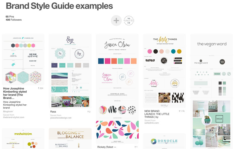
I’ve pulled together some great examples of very simple style guides on my Pinterest board to give you some inspiration on putting together your own style guide for your visual brand:
At the end of the day, I really think the businesses that succeed are the ones that have their branding on-point. I hope this info will help you with your branding and going in the right direction with your visual messaging!
Let me know in the Makers Co Community group if you LOVE designing your own graphics, or if you would only trust a professional designer =)
CAN YOU CONFIDENTLY SAY YOU ARE WORKING ON THE RIGHT THING, RIGHT NOW IN YOUR BUSINESS?
Sometimes, even when we are doing all the right things, it can feel like we’re spinning our wheels and not moving forward at all. This could be because you’re focusing on the wrong area of your business – or doing all the right things, but at the wrong time.

